01A Colour That Needed a New Clay
İznik sits at the eastern edge of a lake in northwestern Turkey, and for most of its history it was a market town that happened to occupy the shell of an ancient city — Nicaea, where a council once debated the nature of Christ. Ceramics were made here for centuries without particular distinction. Then, in the late fifteenth century, something changed: the workshops found a new body.
It was not clay in the ordinary sense. İznik potters developed a composite material — quartz-rich, almost glassy — that behaved more like a raw porcelain than an earthenware. Chinese blue-and-white was arriving through trade routes, and the Ottoman court wanted something that could answer it. The new body gave them the means. Dense, white and tight-grained, it took a fine painted line without bleeding, and under a transparent lead glaze it became a surface that seemed lit from within.
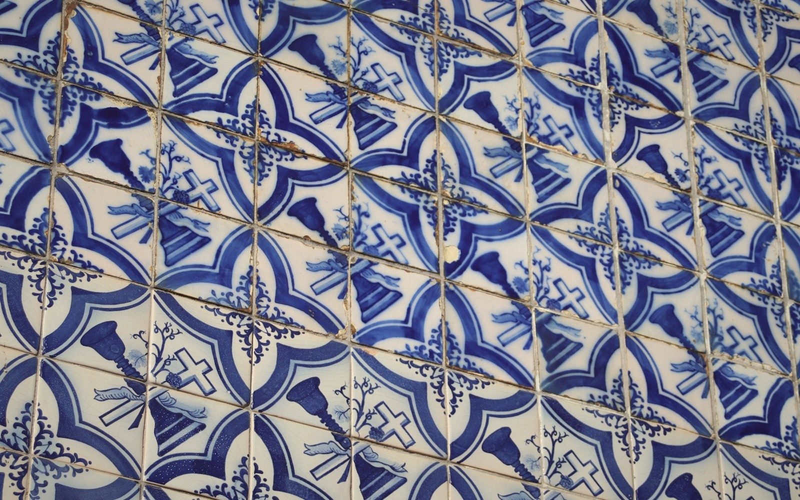
The blue came first. Cobalt oxide, ground and suspended in the slip, fired to a depth that flat reproduction never quite captures. The earliest İznik pieces — produced from the 1480s onward — are often mistaken for Chinese export ware by people who see them in the wrong light. At the right angle, in a museum case where natural light crosses the glaze, you understand that this is something else entirely: a blue that is also a depth.
02The Red That Stood Up
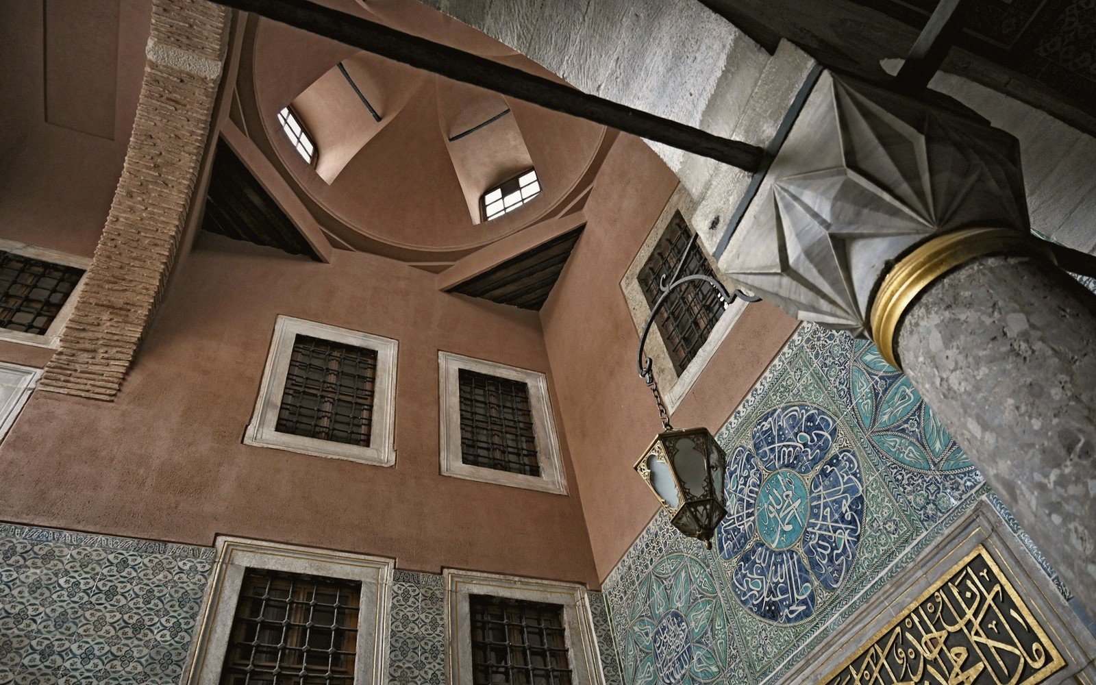
By the mid-sixteenth century the palette had widened. Turquoise appeared, then a sage green, then manganese purple used sparingly for outlines. But the technical breakthrough that defines İznik's peak period — roughly 1550 to 1700 — was a red derived from Armenian bole, a naturally occurring clay rich in iron oxide. Mixed to the right consistency and applied thickly enough, it did not sink into the body during firing. It rose. The surface of a finished İznik tile from this period is not flat: run a fingertip across it and you feel the tomato-red design in low relief, raised above the white ground by a fraction of a millimetre. That is not decorative accident. It is controlled chemistry, and the workshops of İznik were the only ones in the world doing it at scale.
The designs that carried these colours drew on a shared vocabulary: split palmettes, serrated saz leaves, composite flowers that blended the lotus of Chinese tradition with the tulip and carnation of the Ottoman garden. The craftsmen who produced the cartoons — the patterns from which tile fields were assembled — worked in dialogue with court designers in Istanbul. Reading an Anatolian carpet involves a similar vocabulary of field and repeat, and the same design language crossed between media: what appeared on a tile wall could reappear on a textile or a manuscript border. Ottoman visual culture at its height was genuinely integrated.
Turquoise appeared, then a sage green, then manganese purple used sparingly for outlines.